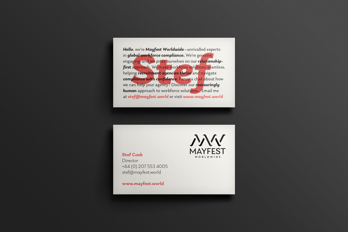
Mayfest Worldwide
Brand Strategy Workshop
Strapline
Positioning statement
Tonal Values
Brand identity design
Brand Guidelines
Brochure design

Brand Strategy Workshop
Strapline
Positioning statement
Tonal Values
Brand identity design
Brand Guidelines
Brochure design
Overview
Mayfest Worldwide provides workforce solutions for recruitment agencies, ensuring compliance, mitigating risk, and simplifying global hiring. Unlike many in their sector, they take a relationship-first approach, offering direct access to expert advisors rather than impersonal platforms or automated systems.
While their business model was well established, they needed a brand identity that reflected their ethos. Workforce solutions branding is often generic, corporate, and indistinct. Mayfest wanted something clean, modern, and distinctive, setting them apart from competitors while reinforcing their expertise and warmth. They engaged The Identity Bureau to develop their brand strategy, positioning, tonal values, and full visual identity, ensuring clarity, consistency, and impact across all brand touchpoints.
Objectives
The project began with a brand strategy workshop with Mayfest’s directors, where we explored their internal brand, mission, vision, and core values. Through this process, we defined their ultimate goal: to deliver exceptional service to the recruitment sector. The workshop also highlighted the importance of creating a brand with real distinction, one that championed their refreshingly human approach to workforce solutions—a point of differentiation that set them apart from the automated, faceless providers in their industry.
From this foundation, we developed a clear positioning statement that articulated their market role and refined their tonal values to ensure their communications felt expert, warm, and approachable.
Visually, we designed a modern, confident brand identity that moved away from the uninspired aesthetics typical of the industry. The minimalist yet bold logo, distinctive Trusted Black, Reassuring Silver, and Warm Coral colour palette, and considered typography all worked together to create a brand that is as professional as it is approachable.
To ensure consistency across all touchpoints, we created comprehensive brand guidelines, giving Mayfest a solid framework for maintaining their visual and verbal identity.
Results
Mayfest Worldwide now has a cohesive, strategically developed brand identity that reflects their expertise, personal approach, and leadership in the industry. Their branding ensures they stand apart in a competitive sector, while their mission, vision, and values provide a strong foundation for growth.
Their refined positioning, tonal values, and visual identity allow them to communicate with confidence across all platforms, reinforcing their commitment to delivering exceptional service. Their tonal values ensure that their communications are clear, personable, and professional—making compliance and workforce solutions feel accessible rather than overwhelming.
At the heart of their brand sits their strapline, “Reassuringly Human Workforce Solutions,” a reflection of everything Mayfest stands for. With a brand that truly represents their strength, expertise, and human-first ethos, they are now positioned for long-term recognition and success. Mayfest Worldwide website design by Asset.
Have you got some ideas about your brand, or perhaps a few burning questions? Why not book a Discovery Call call to have a chat, or answer any questions you have.